Build Capable XCL
Crafting a Patent-Pending Learning Technology into an Award-Winning Accessible SaaS Platform

Overview
Build Capable XCL is a patent-pending learning technology platform designed to make digital training easier to share, access, and track without the cost or complexity of a traditional LMS. The platform lets organizations create branded Learning Links for content like PDFs, videos, documents, presentations, and URLs, then connect that activity to a Learning Record Store.
This case study focuses on my work as the founding design lead, transforming an early technical proof of concept into an award-winning, WCAG 2.1 AA accessibility-verified SaaS product. I worked directly with the CEO and CTO to define the MVP, create the product architecture, establish the brand and design system, write product requirements, design the core workflows, and bring the platform from 0→1.
My Role:
Founding Design Lead
Team Members:
CTO
CEO
Platform
Web SaaS
Project Scope:
0→1 product definition
Product Architecture
Platform Requirements
Brand Guide
Design System
UX/UI Design
Accessibility-focused Workflows
SaaS Account Flows
Recognition:
Patent-pending platform
Gold Award, Most Innovative Learning Technology Product
WCAG 2.1 AA accessibility verified
The Problem and the Opportunity
Traditional LMS platforms can be expensive, rigid, and unnecessarily complex for organizations that simply need to share learning content and understand whether people completed it. Many teams do not need a full LMS, but they still need branded access, reliable tracking, and accessible learner experiences.
Build Capable saw an opportunity to disrupt this model by creating a lighter, more flexible way to deliver learning. Instead of asking organizations to move content into a heavy platform, XCL would let them turn almost any digital learning asset into a branded, trackable link.
The opportunity was to translate a highly innovative technical idea into a product that felt simple, trustworthy, and accessible to use.
The Opportunity
Design a lightweight, accessible platform that could help organizations:
-
Create branded learner-facing pages
-
Share learning content through simple links or QR codes
-
Connect learning activity to an existing LRS or Build Capable-provided LRS
-
Support flexible content types
-
Avoid the complexity of a traditional LMS
-
Meet WCAG 2.1 AA accessibility standards
-
Scale into future reporting and analytics
My Role & The Team
This was my first independent design contract after leading product design teams in-house. I joined the project at an early stage, working directly with Sarah Mercier, Build Capable’s CEO, and Rob Christie the CTO.
The team had a strong product vision and an early developer-built prototype, but the experience needed to be shaped into a complete customer-facing product. I acted as both the strategic design partner and the hands-on designer, helping define what needed to be built, how the product should be structured, and how the experience should look and feel.
My responsibilities extended to:
-
Creating a recommended product design plan
-
Defining MVP scope and priorities
-
Mapping the product architecture and user flows
-
Creating the brand guide and visual identity
-
Exploring mood boards and visual directions
-
Creating the design system and reusable UI patterns
-
Designing the entire platform including the core Brand Template and Learning Link workflows and supporting SaaS areas like account, billing, plans, and support
-
Designing with accessibility as a core constraint throughout
Starting Point: From Proof of Concept to Product
When I joined the project, XCL existed as an early developer-built proof of concept. It showed some of the technical functionality, but it was not yet structured as a complete user experience.
My first step was to review the POC and decipher what had been built, what was missing, what needed clearer labels, and how the platform should be organized. Because I had previously designed several SaaS products from 0→1, I could quickly identify the foundational areas needed for a customer-facing product, including onboarding, navigation, account management, accessibility settings, support, and future analytics.
I created an rough architecture map, as well as a recommended design plan that outlined the product areas, section requirements, and how they linked at a high level. I then reviewed this map with the CEO and CTO to align on priorities, what we needed for an MVP and what could be phased into future phases.
High-level System Map

Early product architecture map created to untangle the technical proof of concept, define the MVP structure, and align the team on core flows, page relationships, and high-level requirements.
Defining the Product Foundation
After reviewing the proof of concept, I created a recommended design plan that outlined the product areas, requirements, and priorities for the MVP. This included the core platform structure, account flows, navigation, Brand Templates, Learning Links, learner-facing pages, support content, billing, and future reporting.
The MVP needed to focus on the actions that made XCL valuable from day one: creating a branded learner-facing experience, attaching learning content to it, publishing a shareable link, and sending activity data to a Learning Record Store.
Reporting and analytics were part of the broader vision, but they were intentionally phased after the core creation and publishing workflows.
Creating a brand that could bridge multiple identities
Before moving into detailed product design, I recommended creating a lean brand guide. XCL needed to feel like a credible SaaS product, but it also had to connect to Build Capable’s existing consulting brand and the Learn xAPI ecosystem.
I explored multiple visual directions using Lato as the core typeface to align with the Build Capable brand. To make the options easier to evaluate, I applied each direction to an early platform home screen so the team could see how the brand would work in product context, in addition to a mood board.
Through several iterations and alignment discussions, we landed on a direction that felt modern, trustworthy, lightweight, and accessible.
Round 2 Moodboard Samples


A selection of round-two mood boards used to compare visual directions, align on tone, and evaluate how XCL could connect to the broader Build Capable brand while still feeling like its own product. I ended up creating a version that is a combination of these two.
Brand Guide


Final brand guide documenting typography, colour, accessibility considerations, iconography, and reusable visual patterns for the XCL product experience.
Building a Practical Design System
As the only designer on the project, I wanted the system to support more than the MVP. It needed to help the CTO build consistently, make future product work easier, and give the team a foundation that could scale if more designers joined later.
I created and refined variables, styles, and reusable patterns for colour, typography, spacing, corner radius, borders, shadows, buttons, forms, navigation, tables, modals, alerts, and system feedback.
Accessibility shaped many of the system decisions. I adjusted colours, contrast, type sizing, form states, labels, helper text, and error patterns so the system could better support WCAG 2.1 AA requirements across both admin and learner-facing experiences.


Designs & Solutions
The First Foundational Challenge: From Point Clouds to QR Anchors
Before we could even begin to solve for turn-by-turn navigation or multi-floor wayfinding, we faced a fundamental technological hurdle. The initial ARway technology relied heavily on Point Cloud mapping, a method that quickly proved to be a significant barrier to our vision of a scalable, precise, and user-friendly indoor navigation system.
The Problem: Point Clouds Were Unviable
We actively attempted to make this technology work, but its inherent complexities led us to a clear conclusion: Point Cloud mapping was not a viable solution.
It presented three core limitations:
-
Usability for Creators: In the web studio, it was exceedingly difficult for creators to interpret the dense point cloud data, making it nearly impossible to intuitively place content and annotate maps.
-
Discoverability for Visitors: For end-users, recognizing how to discover a map or enter an experience was not natural, as it involved non-typical user patterns.
-
Technical Scalability & Practicality: While feasible for small spaces, mapping large, multi-level venues by manually recording with a phone was an impractical and time-consuming process. We required a much faster and more efficient solution for implementation at scale.

V1: Creator mapping a room with point cloud

V1 Web Studio: The studio results of the room after point cloud mapping. As you can see, this is too difficult to interpret the space.
The Breakthrough: Anchoring with QR Codes
To directly address these issues, we innovated a new mapping approach that leverages QR codes as robust localization anchors. This strategic shift not only provided reliable and stable positioning, making the system vastly more scalable for large venues, but also streamlined the entire workflow.
This breakthrough was further enabled by our engineering team's patented AI solution, which is capable of transposing 2D floor plans into precise 3D coordinates using computer vision and sensor fusion, a critical advancement for seamless digital-physical alignment without cumbersome hardware.
The new approach delivered immediate value:
-
Improved Discoverability: Map Visitors could simply "Scan QR to launch" the AR navigation experience, a natural and intuitive user pattern.
-
Reliable Localization: The QR codes provided accurate and stable positioning within any environment.
-
Streamlined Creator Workflow: Creators no longer needed to manually scan the entire venue. They could print and anchor QR codes around a space, enabling a much faster setup

The Second Foundational Challenge: Achieving Precise Digital-Physical Alignment
A major technical and design hurdle we had to overcome was achieving precise alignment between a 2D digital floor plan and its corresponding 3D physical space without relying on expensive or cumbersome hardware. Without this perfect alignment, all subsequent AR wayfinding, navigation, and content placement would be inaccurate, leading to a frustrating user experience.
The Patented Solution: The Floor Plan Alignment Flow
Our engineering team achieved a patented breakthrough: an AI solution that transposes 2D floor plan pixels into 3D coordinates, leveraging Lat/Long, Computer Vision, and Sensor Fusion. My role was to translate this complex AI technology into an intuitive and accessible tool for "no-code" creators.
Floor Plan Image
Anchor pegs on the uploaded 2D floor plan image.

Physical Location
Anchor pegs in AR in the same locations as on the floor plan image file.


Pinned pixels of the floor plan image are anchored to the matching physical locations using AR = “Digital Twin” for web studio
I strategized and led the design for a simple alignment process that leveraged familiar UX patterns, similar to an "Uber Pin Drop" which we called the "Floorplan Alignment" flow. This feature simplified a highly technical process, enabling creators to easily and accurately anchor their digital maps to the physical world.
Floor Plan Alignment: Anchoring and auto-scaling a floor plan to a physical location to enable web studio editing
The Result: Unlocking Precision Annotation and Turn-by-turn Navigation
The floor plan alignment tool was a breakthrough that gave creators a precise method for annotating maps in the Web Studio. This patented technology streamlined workflows by allowing creators to place rich content (3D models, videos, images, hotspots, audio clips, and immersive experiences) directly onto floor plans from their computer rather than manually on-site.
This innovation saved valuable time for clients, but more importantly, it set the stage for our core user-facing features: turn-by-turn navigation and multi-level map connectivity. Together, these capabilities would define the heart of ARway, an intuitive AR navigation experience for visitors, powered by a robust set of creation tools behind the scenes.

Web studio view after floor plan has been successfully anchored and aligned. Hover state on a floor plan peg reminding the creator where the peg was anchored.
1. Designing the Core: Visitor Experience
Although our design process unfolded in parallel, developing both the visitor and creator experiences side by side, the best way to understand the impact of our work is to begin with the end-user journey. After all, every tool we built for creators was in service of enabling a seamless and engaging navigation experience for visitors.
Our challenge was clear: make indoor navigation as intuitive as Google Maps outdoors, while leveraging AR to make it more accessible, engaging and fun.
The visitor experience we designed delivered on this challenge through three key pillars:
-
A smart, searchable in-app directory for effortless discovery.
-
Intelligent route selection with accessibility built in.
-
Immersive, turn-by-turn AR navigation, including support for multi-level venues via the map connector.
1. 2D Map Viewer and Level Selector
Visitors can tap the 2D map icon while in AR to get a clear overview of the venue. A level selector button indicates their current floor and allows switching between levels, while interactive location pins provide details and let users instantly launch navigation to their desired destination.
Impact: Made multi-level navigation intuitive and seamless, giving visitors confidence and control over their journey.
2. The In-App Directory
We designed the journey to begin with a comprehensive, searchable directory, organized into categories like “Women’s Apparel,” “Electronics,” and “Amenities.” Visitors could quickly search or browse, making discovery effortless.
Impact: Reduced visitor frustration and streamlined access to essential services like restrooms and info desks.
3. Route Options & Wheelchair Accessibility
When selecting a destination, visitors could choose between fastest routes or wheelchair-accessible paths. Visitors could also view routes that were between levels.
Impact: Ensured inclusivity and adaptability across diverse user needs.
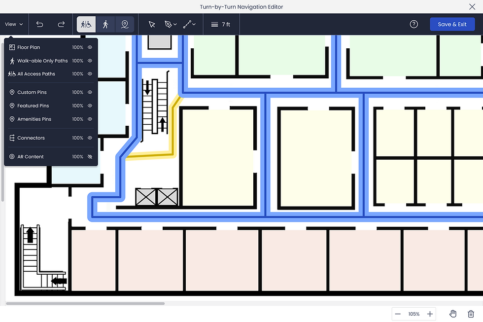
Route Visibility: Designing visible routes are on varied floor maps
A major design challenge was ensuring paths remained clear on varied floor plan styles (dark, busy, neutral). I tested multiple visual approaches, ultimately designing a dual-line route with a high-contrast core for maximum clarity and a more visually accessible experience.


Typical Floorplan
Dark Floor Plan


Busy Floor Plan
Neutral Floor Plan
Impact: Consistent route legibility across any floor plan type for improved accessibility.
4. Immersive Turn-by-Turn AR Navigation
Once a route was chosen, the app transitioned into live AR mode, overlaying intuitive directional cues onto the physical environment.
Impact: Eliminated guesswork, making navigation engaging, effortless and memorable.
Navigation Themes: Expanding Use Cases Through Customizable Route Styles
In ARway’s early stages, route guidance relied on a single path style with limited color customization. As the product expanded beyond corporate and enterprise environments, we needed a more flexible system that could support both practical wayfinding and more immersive branded experiences.
I designed a set of customizable navigation themes, including jumbo chevrons, glowing routes, spheres, and flat lines. Some were created to add visual energy for retail, events, and entertainment spaces, while others improved usability by making paths easier to follow and more forgiving when AR drift occurred. Combined with brand color customization, these themes helped ARway support a wider range of clients and environments.


Jumbo
Spheres


Glowing
Flat Path
Impact: Transformed simple navigation into a branded, fun and differentiated visitor experience.
Behind the Scenes: Building for Creators
The seamless visitor journey you’ve just seen didn’t exist in isolation, it was only possible because of a powerful set of tools we designed for Map Creators. These tools needed to balance two competing demands:
-
Sophistication: enabling the creation of accurate, multi-level, turn-by-turn maps at scale.
-
Simplicity: ensuring non-technical users could intuitively build and manage these complex AR environments.
To achieve this, our team designed in parallel: while we defined the end-to-end visitor experience, we also crafted the creator workflows that powered it. This dual-track approach ensured that every feature released, from turn-by-turn navigation to the map connector, launched with both sides of the ecosystem in place.
The next sections detail how we tackled this challenge: first, by designing the turn-by-turn creation tools, and then by solving the complex problem of connecting multi-level maps into a seamless venue-wide navigation system.
Designing the Core: Turn-by-Turn Creation Tools
The goal was clear: if visitors were to enjoy effortless, turn-by-turn AR navigation, creators needed tools that made mapping complex indoor spaces simple, accurate, and scalable.
This meant tackling two layers of design simultaneously:
-
The visitor-facing experience, ensuring navigation felt seamless and intuitive.
-
The creator-facing workflows, giving non-technical users the ability to annotate floor plans, set up routes, and manage venues without friction.
As Director of Product Design, I led the overall design strategy across web and mobile, guiding our senior product designer on studio workflows while personally owning the mobile visitor and creator app design. Together, we designed a system that made building these advanced navigation experiences as intuitive as using them.
1. Directory Builder Workspace
A critical challenge was to simplify annotating a complex 3D space. A bird's-eye 2D view would be more accurate and easier to place content more accurately than navigating a 3D environment. A key design decision was to create a dedicated, focused workspace that would appear when the directory builder tool was selected. This new frame provided a distraction-free environment to focus solely on adding location pins and defining walkable areas.


Impact: Non-technical creators could build sophisticated AR maps efficiently.
2. Onboarding & Guided Support
To ensure our clients were supported and could discover new features, we designed a layered onboarding system:
-
Quick-start modals with GIFs
-
Step-by-step guided tours
-
Always-available in-app tooltips


Impact: Enables creators to learn at their own pace and build confidence.
3. Path Mapping Challenge: A Lesson in Collaboration
Our journey designing the turn-by-turn path tool was not without its challenges. We initially aligned on a plan to use shape-based tools to block off inaccessible areas. The Senior Designer spent 2 weeks designing this feature based on the approved requirements.
However, during a subsequent review, our engineering team revealed that this solution was not technically feasible. This resulted in a two-week delay and highlighted a critical need for a more robust cross-functional process. To prevent this from happening again, I led the creation of a new, company-wide design collaboration process to ensure alignment with stakeholders, product and engineering from the outset. (Streamlining Product Delivery) We quickly pivoted to a line based approach and kept moving forward.
Our new approach: a tool to draw the paths themselves. The design enables creators to draw straight or curved paths, define their widths, and select from "walkable only" or "all access/wheelchair accessible." Our goal was to make this highly complex task as intuitive as possible, especially for users without a design background.


Impact: Simplified a highly complex task, strengthened cross-team collaboration and accelerated feature delivery.
4. Location Pin Placement & Customization
Creators could place pins directly on paths, with instant validation (green outline) when positioned correctly. Each pin included robust customization: branding, images, descriptions, documents, and categorization.


Impact: Allowed venues to create rich, branded experiences while ensuring accuracy.
5. Post-Launch Analytics
After launch, client feedback revealed the need for better visitor insights. We added analytics to the My Maps area, giving creators visibility into:
-
Route analysis (which paths were most used, individual routes taken, time of day and duration)
-
Destination popularity, Time of navigations,
-
Visitor feedback (e.g., thumbs-up ratings and comments)


Impact: Enables data-driven decisions about venue layouts and content strategy.
Outcomes
We built a turn-by-turn navigation system that was intuitive, inclusive, and scalable. Visitors could confidently navigate complex venues in real time, while creators had powerful, no-code tools to build and manage AR maps at scale.
This success directly set the stage for the next evolution of the product: enabling navigation across multi-level environments with the Map Connector tool.
Designing the Core: Map Connector Tool
If turn-by-turn navigation made ARway useful for single level spaces, the Map Connector tool unlocked scale. It allowed creators to link multiple maps, levels, zones, or areas, into a seamless, multi-level venue map. With this feature, ARway transformed from an indoor wayfinding solution into a platform capable of powering large-scale venues like airports, malls, and convention centers.
The Design Challenge
-
Creator Complexity: Linking maps together accurately across elevators, stairs, escalators, corridors, and bridges was a cognitively heavy task. We needed to simplify it so non-technical creators could succeed.
-
Visitor Experience: Routing had to remain seamless. Visitors shouldn’t need to think about “switching maps” navigation should feel like one continuous journey, regardless of floors or zones.
-
Flexibility: Venues differ, some have levels, others have zones, so we needed to support multiple naming conventions and structures.
-
Reliability: Connectors needed to be editable post-setup, so creators could update or disable them in real time (e.g., escalator out of service).
1. Building the Venue Map
Creators could build a venue map by selecting individual maps (levels or areas) within the CMS or Studio. They were prompted to:
-
Group maps into a unified structure "Venue Map".
-
Enter venue details (title, description, branding)
-
Define naming conventions for levels/zones (e.g., “Level 1 / Level 2” vs. “Zone A / Zone B”)


Impact: A flexible system that could adapt to diverse venue types beyond traditional multi-floor buildings.
2. Adding Connector Pins
Once a venue was defined, creators were onboarded through guided modals explaining how to link levels via connector pins.
-
Elevators: Creators named elevator groups, pinned them across levels, and could later edit or disable individual elevators if out of service.
-
Escalators: More complex, creators specified single-direction vs. dual-direction. For single, they placed entry and exit pins; for dual, just one pin per level.
-
Stairs, bridges, corridors: Supported as straightforward two-point connectors between maps.


Impact: Reduced risk of set-up errors while ensuring visitors received accurate routing through complex venues.
3. Connector Manager
To simplify ongoing management, we designed a Connector Manager, a centralized dashboard where creators could:
-
View all connectors at a glance as well as edit and make changes
-
Toggle connectors on/off (e.g., if under maintenance)
-
Validate connections to ensure continuity between maps


Impact: Gave creatos ongoing control and confidence, ensuring venue maps remaind accurate and up-to-date..
Outcome
The Map Connector tool completed ARway’s core navigation system, enabling:
-
Scalability: From single-level maps to large, multi-floor or multi-zone venues.
-
Creator Usability: Intuitive tools, onboarding, and management systems that demystified a complex process.
-
Visitor Seamlessness: One continuous navigation journey, regardless of venue complexity.
Together with turn-by-turn navigation, this feature positioned ARway as a true large-scale AR wayfinding solution.
Watch ARway in Action
This video demonstrates ARway in the real world, showcasing both sides of the platform. Visitors navigate seamlessly through complex venues with turn-by-turn AR guidance, while creators build, align, and manage maps directly from the web studio. Together, these experiences illustrate the power of ARway as a scalable indoor navigation solution.

Beyond the Core
Once the foundational system of alignment, navigation, and connectors was in place, we rapidly expanded ARway’s capabilities to support enterprise needs and unlock richer experiences. These additional features demonstrated the scalability of our platform and broadened its adoption across industries:

User Management
Introduced role-based access with Owners, Admins, Editors, and Guests. Permissions could be customized at both user and member levels, giving enterprises fine-grained control over how teams collaborated in the platform.

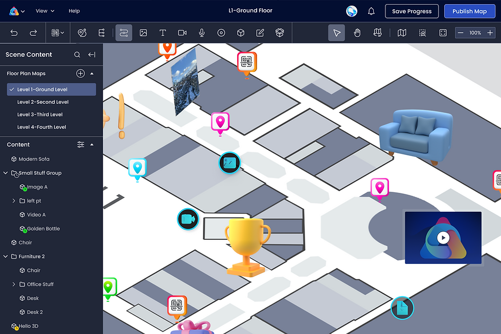
AR Content & Studio Enhancements
Improved the Map Studio to make content placement faster, more accurate, and easier to manage at scale. Expanded AR content capabilities to include interactive hotspots, audio, video, Unity-based experiences, and timed/scheduled content for seasonal or event-driven activations.

Kiosk Mode
Designed a mall-style kiosk experience where visitors could search destinations, preview routes, and then seamlessly hand off navigation to their mobile device by scanning a QR code from a digital mall display.

Guided Tours
Created a tool for curated visitor paths with start and end points, blending navigation with storytelling for exhibitions, campuses, and training environments.
Outcomes & Impact:
0–1 Product Launch
Built and launched ARway.ai in just 24 months
Sales Pipeline
$3.6M Generated
Platform Reach
Deployed across iOS, Android, Apple Vision Pro, Magic Leap and SDK Integrations
Market Adoption
200+ subscribers, 7,800+ users, 45+ paid pilots
Industry Recognition
Apple Developer Program
Key Partners & Pilots
Gov't of Canada, Toronto Metropolitan University, Boston Children's Hospital, Tanger Outlets, Localiza
Navigating Challenges & My Leadership Responses
The journey was not without significant challenges. Early on, we faced:
-
Resource Constraints: A small design team spread thin.
-
Funding Limitations: Impacting team size and speed.
-
Market Barriers: Lack of established enterprise sales channels.
-
Leadership Change: An executive departure just six months into the product build.
To keep momentum, I stepped in with proactive leadership:
-
Hired and onboarded a new designer to own the critical floor plan alignment feature.
-
Took on additional product management responsibilities, including strategy and vision.
-
Created ARway’s full brand guide and visual identity personally.
-
Successfully balanced ARway’s design leadership while managing three other major Nextech products in parallel.
Key Learnings & Leadership Growth
This experience shaped not only ARway as a product but also my growth as a design leader:

Collaboration
Learned the critical importance of deep, early alignment with product, engineering and data science when designing around novel technologies.

Process Evaluation
From a major “path tool pivot,” I spearheaded a new company-wide collaboration process, improving cross-functional alignment between Product, Design, and Engineering.

Scope & Capacity Management
Successfully led ARway’s complex design strategy while guiding UX for three additional Nextech products simultaneously.

Mentorship
Mentored designers and new PMs, reinforcing design best practices in AR, AI, and no-code platforms.

Strategy
Adapted core design principles for the unique challenges of emerging technologies.
Conclusion
ARway was more than a product launch, it was the creation of an entirely new category of indoor navigation. Leading this product from 0–1, I not only shaped its design strategy and execution but also strengthened company-wide design processes, mentored new talent, and delivered a solution recognized by partners, enterprises, and industry leaders alike.
Thanks for Reading
Check out more of my projects, or reach out if you want to learn more about this one!


