LiveX
Guiding the Transformation of a Legacy Platform into an AR-Rich Hybrid Solution
Overview
The LiveX project was Nextech AR's ambitious initiative to transform its floor plan event planning platform into a leading virtual and hybrid event experience. As the acting Manager of Product Design, I led a team of six designers through the UX/UI overhaul of the existing Map Dynamics platform and the subsequent development of innovative virtual event features for LiveX. This case study details the design evolution, key innovations, challenges faced during a rapidly evolving market, and crucial lessons learned.
Project Duration
6 months
December 2020 - June 2021
Product
Responsive Hybrid Events Platform
& Companion App
My Role
Manager of Product Design
Design Team Roles:
2x Visual Designers
4x UX Designers
The Challenge
The project addressed a dual challenge: first, to redesign the existing Map Dynamics event and floorplan management platform, which suffered from an outdated design, developer-led approach, poor user experience, and accessibility issues; and second, to expand it into LiveX, a brand new comprehensive virtual and hybrid event experience to address the surge in demand for virtual solutions.
Key challenges included:
-
Creating engaging virtual experiences (replicating in-person interaction, networking and excitement)
-
Integrating emerging technologies (AR, 3D) to enhance engagement
-
Designing for diverse user groups (event managers, attendees, presenters, sponsors)
-
Rapid development and scaling to meet market demand
-
Balancing visual customization with accessibility standards
-
Designing the end-user platform within fixed-width containers dictated by the underlying engineering framework (Liquid)
My Role & Responsibilities
As the acting Product Design Manager, I played a pivotal role in shaping the vision and execution of LiveX. My key responsibilities included:

Defining Product Vision and Strategy
I worked closely with stakeholders and product managers to define the product roadmap, prioritize features, and align design goals with business objectives.

Managing Design Team
I managed a team of 6 designers, providing guidance, mentorship, and support throughout the design process. I was responsible for assigning tasks, setting design direction, and ensuring design quality.

Establishing Design Processes and Standards
I implemented design processes and established a design system to ensure consistency and efficiency across the project.

Facilitating Cross-Functional Collaboration
I fostered strong collaboration between design, product management, and engineering teams to ensure effective communication, alignment, and feasibility.

Feature Definition and Implementation
I actively collaborated with stakeholders and product managers to strategize, define, lead, and implement the design of new features.
The Design Process
The project involved a multi-phased design process, starting with the revitalization of Map Dynamics and evolving into the development of LiveX.
Project Timeline
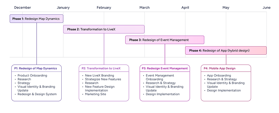
Phase 1: Redesigning Map Dynamics
1. Research & Discovery
Goal: To understand user needs and pain points for both the existing Map Dynamics platform and in the context of virtual events.
-
Research methods: user interviews, focus groups, surveys, competitive analysis, user feedback.
-
Key findings informed design strategy and prioritized UX improvements and features offering the most user value.

Competitive Analysis
2. Strategy & Planning
Goal: To define the product roadmap, features, research and define the plan for both the Map Dynamics redesign and LiveX design stages.
-
Aligned product roadmap and prioritized features based on research and client needs.
-
Developed user flows, information architecture, and wireframes to outline the user experience.

Sitemap Plan Phase 2
3. Design Execution
"30 Day Redesign" of Map Dynamics
Goal: To update the UI to a clean modern look, improve accessibility and readability, along with making minor UX improvements for the attendee facing part of the platform
Key initiatives included:
-
A new visual identity and branding to modernize the platform.
-
An updated user interface design to improve usability and accessibility.
-
Improved navigation and menu to enhance user flow.
-
The creation of a design system to ensure consistency and speed.
Old Map Dynamics Interfaces
The original Map Dynamics interface presented a significant challenge in terms of navigation and task completion. Improper labeling and a complex information architecture made it difficult for users to find information and complete desired actions. The interface also featured a visually dense layout and alongside various accessibility issues.


Phase 1 Redesigned Interfaces
The Phase 1 redesigned interfaces features a cleaner layout, improved navigation for key tasks, a customizable background and a more visually engaging introduction to the platform. We streamlined the Information Architecture, making it easier for users to access relevant content and upcoming events. The updated UI had a visually appealing glass border effect all while keeping it accessible and also incorporated the new design system and updated branding.


Phase 2: The Transition to LiveX
Building upon the redesigned Map Dynamics platform, we focused on rebranding map dynamics into LiveX, improving and developing new core features, as well as making larger UX improvements including:
-
New Interactive 3D Lobby Designs
-
New Interactive Exhibition Hall with a variety of 3D and 2D booth styles
-
Event and Booth Customization
-
New Live Chat functionality for real-time interaction.
-
Leaderboard and gamification for attendee engagement and sponsorship opportunities
-
New AR Product Showcases to enhance the marketplace experiences
-
New Live Stages for live or pre-recoreded presentations with pop-out abilities, Q&A, polls, and surveys.
-
New virtual meeting and Networking Rooms
-
New Ads Network for increased sponsorship visibility and monetization
-
New Event Ticketing, global account creation, marketing website and global attendee accounts
LiveX Interfaces: New Core Features
Lobby/Home
To cater to diverse user needs, LiveX introduced a range of lobby experiences. Visually rich and interactive 3D lobbies provided an engaging entry, accessible versions ensured inclusivity, and efficient 2D layouts offered simplicity. This approach balanced the desire for immersive environments with the importance of accessible design.

Our 3D design team created custom 3D lobbies for premium clients. Items in the frame were clickable.

The full screen was also an option available to clients, although less accessible this was one version that our clients asked for and were engaged in.

This is our most basic lobby design. Events that may use this design did not have live presentations.
Our 3D design team created custom 3D lobbies for premium clients. Items in the frame were clickable.
Exhibition Hall & Exhibitor Booths
LiveX introduced the Exhibitor Hall to extend event engagement beyond sessions. We designed tiered booth options to meet varying exhibitor needs: default booths for essential information, customizable booths for enhanced branding (like the Spotify example), and visually rich Curator booths responding to client demand for a 3D feel. This flexibility allowed exhibitors to choose the best format to connect with attendees.


Virtual Networking Lounges & Meeting Rooms
The platform featured interactive Networking Lounges, providing themed spaces for attendees to spontaneously engage in group discussions and build relationships in a more casual setting. Complementing this were dedicated Networking Rooms, offering more structured interactions with options for private meetings, timed sessions, and host controls like locking and breakout rooms.
This dual approach aimed to replicate the diverse networking opportunities found at in-person events, from casual encounters to focused discussions, making it a significant design undertaking to ensure seamless and intuitive user experiences across both formats.

This is the event networking rooms page where all networking rooms or lounges could be accessed.

This was a different style of networking room where Moderators could select how many people could enter each room, and was driven by client needs.

Room moderators had many settings and options for how they controlled their networking rooms and pods.
This is the event networking rooms page where all networking rooms or lounges could be accessed.
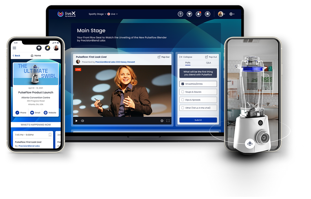
Live Stages & Auditoriums
LiveX expanded event capacity with dedicated Main Stages and Auditoriums. These virtual venues supported large-scale presentations, incorporating features like a "Pop Out" view for continuous viewing while navigating the event. Attendee engagement was enhanced through integrated Q&A and polling, creating interactive and dynamic sessions. The design addressed both the attendee interface and the backend controls for presenters and event managers.

Events could have multiple Auditoriums or stages. Interactive Polls and Q&A were also available and managed in the back end.

Presenters could offer interactive Q&A periods during their presentations

The upcoming presentations and info were also displayed below the video to let viewers know what was up next at that specific stage.
Events could have multiple Auditoriums or stages. Interactive Polls and Q&A were also available and managed in the back end.
Leaderboard & Gamification
LiveX incorporated a Leaderboard and Gamification system to boost attendee engagement and encourage friendly competition. Points were awarded for various activities, tracked on a real-time Leaderboard visible to participants. Challenges incentivized specific actions like attending sessions and visiting booths, adding a layer of interactive fun. This new feature aimed to drive active participation, foster a sense of community, encourage attendees to engage with AR, and reward attendees for exploring different aspects of the virtual event.

Attendees could opt in to play along to win prizes so long as they filled out their profile information.

Players who were in the top 3 would have a unique placement visual in the top right. Players could also view the challenges that they would need to complete to gain points.

Viewers would be notified when they won. Messages in this notification could be edited by the event manager.
Attendees could opt in to play along to win prizes so long as they filled out their profile information.
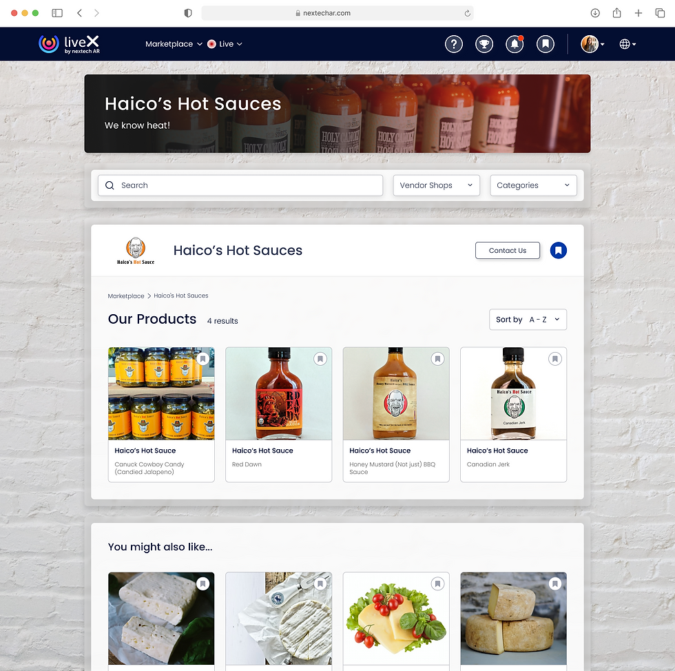
Marketplace
LiveX expanded its functionality by implementing a comprehensive Marketplace feature, built from the ground up to offer users a seamless shopping experience within the platform. Our team collaborated closely with Restaurants Canada to integrate valuable client feedback into the design, ensuring the Marketplace effectively addressed real-world user needs. This new addition streamlined the process of Browse and purchasing a variety of products, providing a centralized and intuitive solution for attendees.


Event Ticketing & Discovery
LiveX expanded its functionality by implementing Ticketing and Attendee Account Management systems, both net new additions to the platform. The ticketing system streamlined the registration process with customizable options and secure payment processing. The Attendee Account Management system provided attendees with greater control over their event experience, offering a central location to manage their schedules, tickets, and event information.

Attendees could purchase tickets to any LiveX event.

Attendees could pay for their tickets directly through the site with any major credit card.

A robust help and support section was also available for attendees to ensure they could adjust the LiveX experience to meet their desired needs.
Attendees could purchase tickets to any LiveX event.
Phase 3: Event Management Redesign
This phase focused on a minor UX and major UI overhaul of the event management side of the platform, used primarily by event managers and exhibitors to create and manage their events.
Original Map Dynamics Interfaces
The original event management interface within Map Dynamics, while providing the necessary tools for event setup and configuration, presented a less intuitive user experience. The interface was characterized by a dense layout with numerous fields and options, potentially leading to a steeper learning curve for event managers. The visual design lacked modern conventions, and the information architecture could be challenging for users to navigate efficiently when creating and managing their events.


Event Management Redesign:
This phase focused on a complete UX and UI overhaul of the backend interface used by event managers to create and manage their events.
-
Intuitive workflows for event setup and configuration.
-
Enhanced customization options, allowing event managers to personalize the visual appearance of their events.
-
Design and implementation of tools for background customization, image uploading, colour palette selection, and header style choices all while ensuring we implemented best practices for visual accessibility standards.
-
Live Stage presentation management
-
Exhibitor Management
-
Event App set-up and configuration
My Events
The redesigned "My Events" section provided a significantly enhanced experience for users to manage their events within the platform. While operating under a tight timeline that limited a full UX overhaul, we focused on a major UI lift and targeted UX improvements. Guided by my direction, two senior UX designers streamlined the visual presentation, making it cleaner and more intuitive. Key improvements included enhanced visual hierarchy for easier scanning, clearer presentation of event details, and significant advancements in accessibility to ensure a more inclusive user experience.


Individual Event Dashboard
This redesign of the Individual Event Dashboard focused on enhancing visual hierarchy and usability for event managers. The updated layout offers a cleaner presentation of event details, making it easier to scan and locate necessary information. Improved grouping of features and clearer labeling contribute to a more intuitive user experience, addressing usability issues of the older design. These changes empower event organizers to manage their events with greater ease and confidence.

Event Setup
Event managers experienced a clearer and easier "Event Setup" process. The updated design guided users through the creation of events with well-defined stages and visual prompts. Compared to the previous interface, the new design prioritized ease of use, making it simpler to manage event settings and input necessary details.


Exhibitor Management
The Exhibitor Management system streamlined the process of onboarding and managing exhibitors for event organizers. Event managers could efficiently populate the platform with exhibitor lists by uploading an Excel sheet, saving significant time and effort. Furthermore, the platform empowered individual exhibitors by providing them with direct access to set up and customize their virtual or hybrid booth information, ensuring they could showcase their brand and offerings effectively. This dual functionality simplified exhibitor onboarding and provided exhibitors with control over their virtual presence.


Mobile App Management
The redesigned "App Management" section provided event organizers with a clearer and easier way to customize their event's mobile app. The interface guided users through key settings like branding and navigation with well-defined stages. Although the visual representation in this tool depicted the previous app design, a new attendee-facing app was in parallel development to provide an improved mobile experience.


Phase 4: Hybrid Companion App Design
We designed a companion mobile app to enhance the in-person event experience, creating a hybrid event solution. I worked closely with a designer to design and develop the app in its entirety.
Key features:
-
Networking tools to facilitate connections between attendees.
-
Interactive features for participating in live presentations.
-
Interactive Floor Map to help locate booths and event destinations.
-
A leaderboard and gamification elements to drive engagement.
This app was crucial for providing a seamless experience for attendees at both virtual and physical events.
Old App Interfaces
The initial app design suffered from significant usability and accessibility shortcomings. Attendees struggled with a confusing layout and structure, which impeded efficient navigation and task completion. The ability for organizers to freely change app colours often exacerbated accessibility issues. Furthermore, the app's visual style appeared dated and failed to meet modern mobile design standards.


New App Design
Schedule and Interactive Live Stages
The app provided a comprehensive Schedule, allowing attendees to easily browse and plan their participation in various sessions. Within the live stages, attendees experienced interactive tools for engagement, such as live polls and Q&A. Importantly, users had the flexibility to minimize or turn off the live video stream while still actively participating in polls and submitting questions in real-time. This design choice catered to different user preferences, ensuring that all attendees could engage with the content and presenters, regardless of if they were at the physical presentation or elsewhere.
Networking Tools
The companion app introduced several significant new networking features designed to enhance attendee connections and facilitate interaction. Attendees could now scan QR codes to quickly exchange contact information, streamlining the process of connecting with others. The "My Network" section provided a dedicated space to view and manage connections, with options to filter and organize contacts. Furthermore, attendees could utilize a "People Near Me" feature (when location permissions were enabled) to discover and connect with other attendees in their vicinity, fostering spontaneous in-person interactions. The app also included "Invisible Mode," offering users control over their visibility to other attendees. These new features aimed to make networking more efficient, discoverable, and personalized for all event participants.
Venue Maps
The redesigned Interactive Venue Map addressed significant usability issues present in the original version. We implemented intuitive pan and zoom controls, along with a helpful onboarding screen to guide users on map interactions. Tapping on a location now directly revealed relevant information about a booth or area. Furthermore, users could seamlessly navigate from the map to the full exhibitor page for more detailed information. These interaction and usability enhancements transformed a frustrating feature into a valuable tool for event navigation and discovery.
Leaderboard & Gamification
The new companion app introduced a Leaderboard and Gamification system to enhance engagement across all event formats: virtual, hybrid, and in-person. This net-new feature allowed attendees to earn points by participating in various activities, fostering a sense of friendly competition. Challenges, as showcased here with in-person examples, could be dynamically adapted to reward engagement in virtual sessions and on-site interactions alike. The Leaderboard provided a real-time view of top participants, encouraging active involvement and making the event experience more interactive and rewarding.
Outcomes & Impact:
The LiveX project, while ultimately navigating a dynamic market, yielded notable achievements and contributed valuable assets to Nextech AR's portfolio.:

Successful Modernization of Map Dynamics: The initial UX/UI overhaul provided a contemporary, user-friendly, and accessible platform, crucial for retaining clients and establishing a foundation for future growth.

Innovation in Virtual Events with LiveX: LiveX positioned Nextech AR at the forefront of virtual event technology, introducing engaging features like interactive 3D booths and AR product showcases that offered novel experiences during a critical period for virtual engagement.

High-Profile Event Success with LiveX: The "LiveNow" showcase featuring Gary Vaynerchuk demonstrated LiveX's capability to host significant virtual events and attract prominent figures, generating positive brand visibility for Nextech AR.

Significant Positive Impact of the Companion App (Now MapD App): The companion app, delivered substantial value by enhancing attendee engagement at in-person events through interactive networking, presentation participation features, and gamification. This positive reception directly contributed to increased client satisfaction and a measurable rise in sales. The app's continued success as the MapD app underscores its lasting impact.
.png)
Initial Positive Financial Indicators with LiveX: During the initial rollout of LiveX, Nextech AR reported a significant increase in gross profit (over 280%) and total bookings (over 4700%) in Q1 2021. While these figures reflect overall company performance, they indicate a period of strong growth coinciding with the LiveX launch and suggest a positive initial market response to the platform's potential.

Strategic Pivot to MapD: The strategic decision to focus on the in-person event market with MapD, leveraging the successful technology of the evolved LiveX app, demonstrates adaptability and a commitment to sustainable growth. The positive feedback and continued use of the MapD app validate this strategic direction.
Lessons Learned
The LiveX project, while facing significant headwinds, provided invaluable learning experiences that have shaped my approach to product design leadership:
The Importance of Foundational UX:
The success of the Map Dynamics redesign highlighted the critical importance of establishing a solid UX foundation before building complex features.
Navigating Rapid Market Shifts:
The pandemic created a volatile market, and the rapid shift back to in-person events underscored the importance of building adaptable and resilient products that can pivot with changing user needs and market dynamics.
The Human Impact of Rapid Growth and Downsizing:
Leading a design team through a period of explosive growth followed by significant layoffs was a challenging experience that reinforced the importance of clear communication, empathy, and supporting team members during times of uncertainty.
Thanks for Reading
Check out more of my projects, or reach out if you want to learn more about this one!


